A logo design, colors, and typography for an architecture studio.
Creo's vision was crystal clear – to become a revered leader in the realm of interior and architectural design while upholding their unwavering dedication to innovation and aesthetics. Our mission? To translate this vision into a visual identity that resonated with authenticity.
Concept:
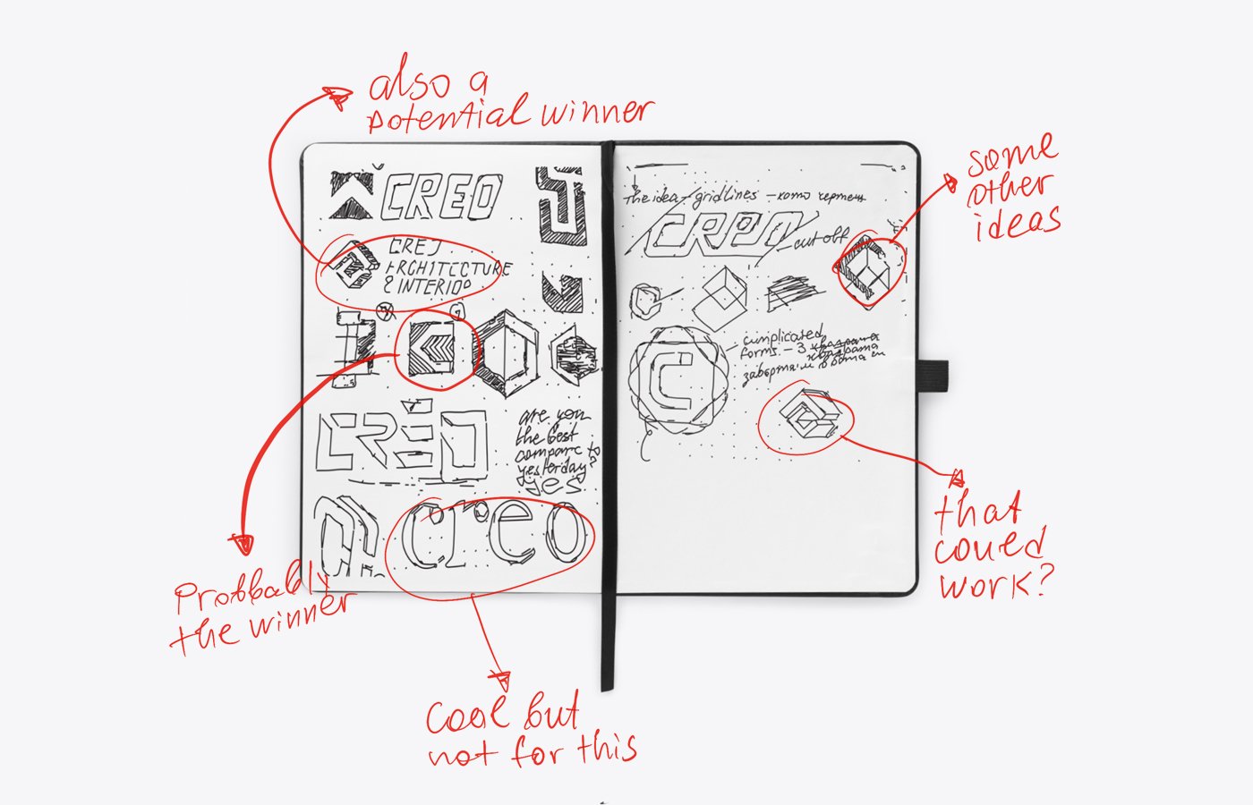
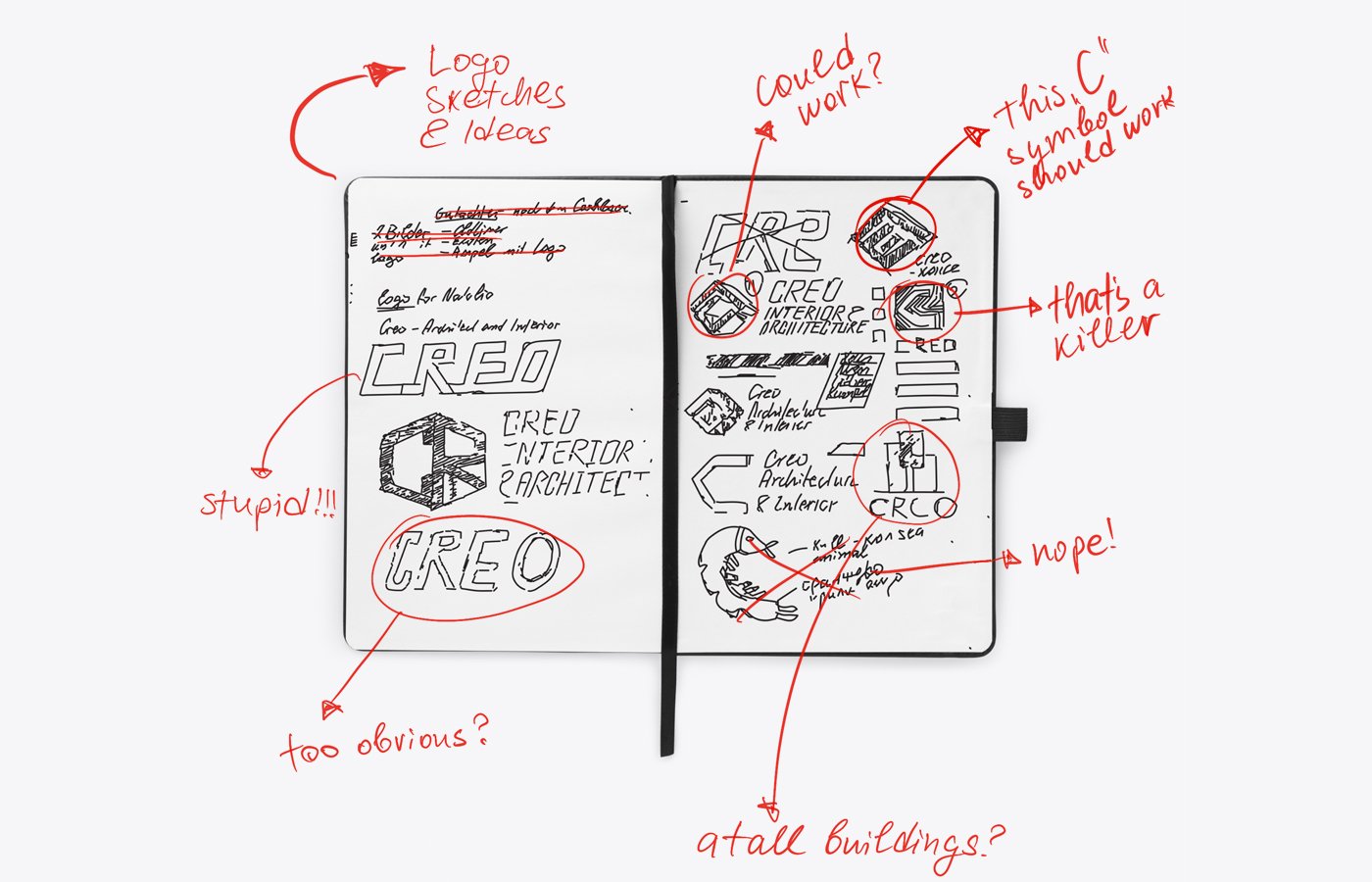
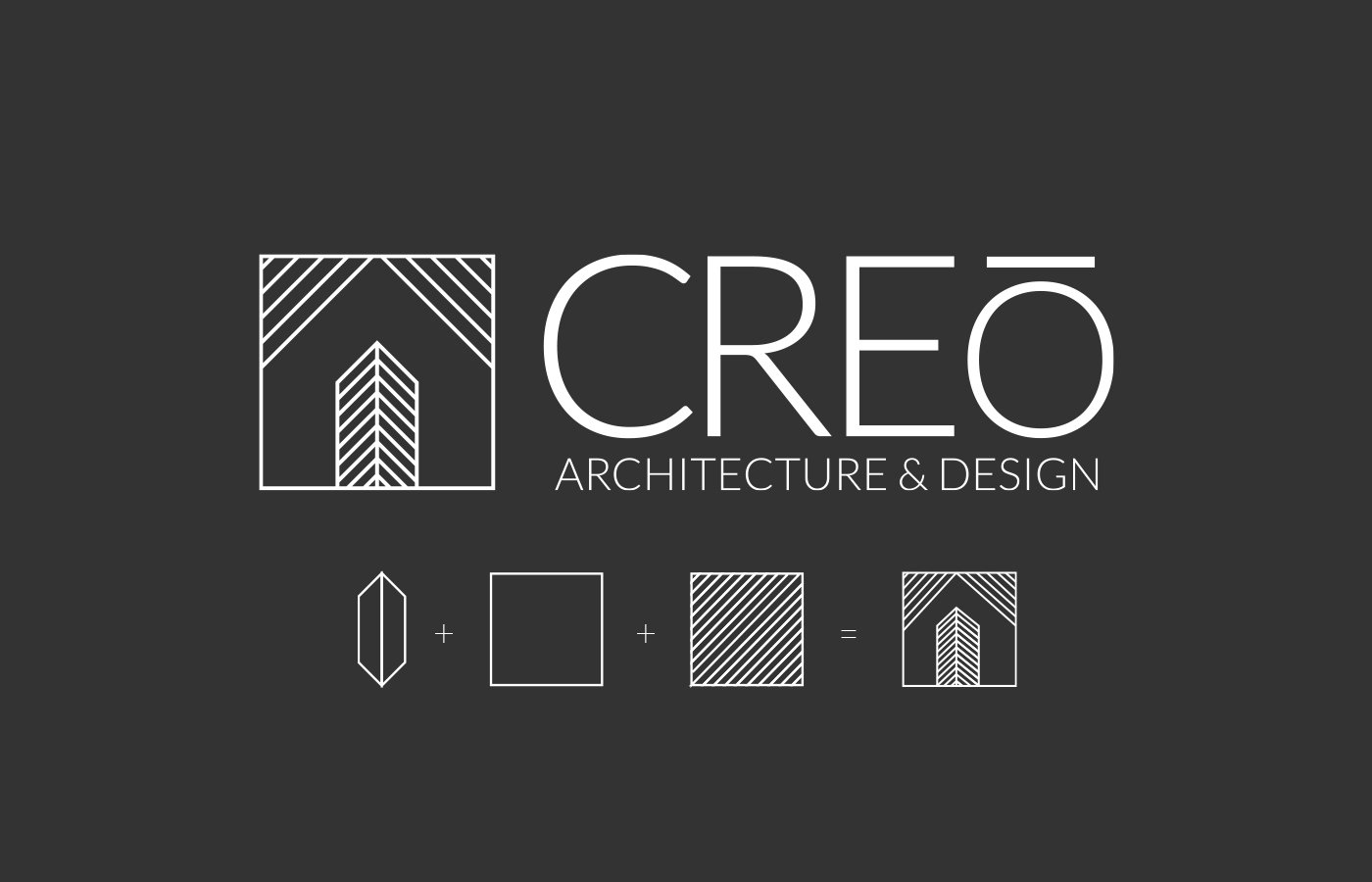
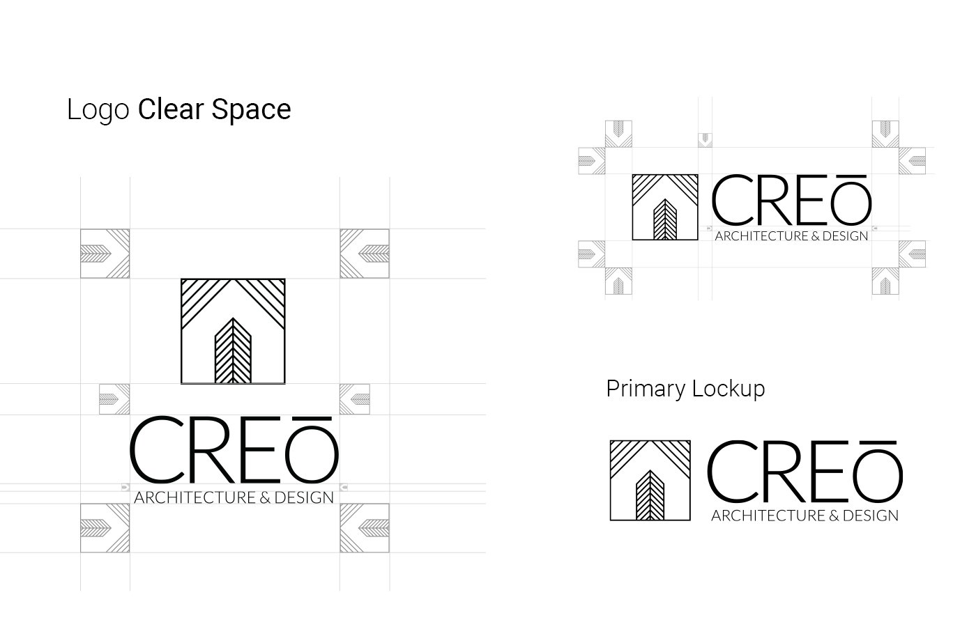
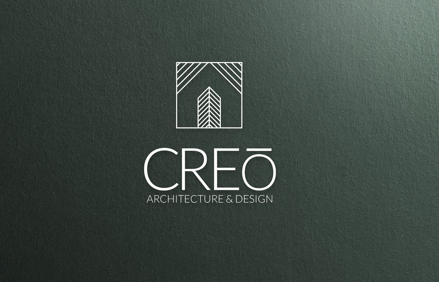
The heart of our creative journey commenced with the logo. We grasped that it had to be more than just an icon; it needed to embody Creo's values. After countless iterations and intense brainstorming sessions, we unveiled a logo that captured the essence of creativity, precision, and artistic expression. Its elegant yet dynamic design mirrors Creo's commitment to transforming spaces. This is why we chose to work with thin lines to shape a house, the letter ‘‘c’’, and a building, but in a way that reminds us of an interior wooden floor.
Creating a brand presence that harmonized with Creo's ethos was paramount. We painstakingly designed an identity that showcased their portfolio and transformed the user experience into a visual voyage. Every element, from the layout to the imagery, was meticulously chosen to ensure a seamless and engaging digital presence.